BOOK YOUR COLOUR CONSULTATION
FAQ
Colour Consultancy
FAQ's
Contact Us
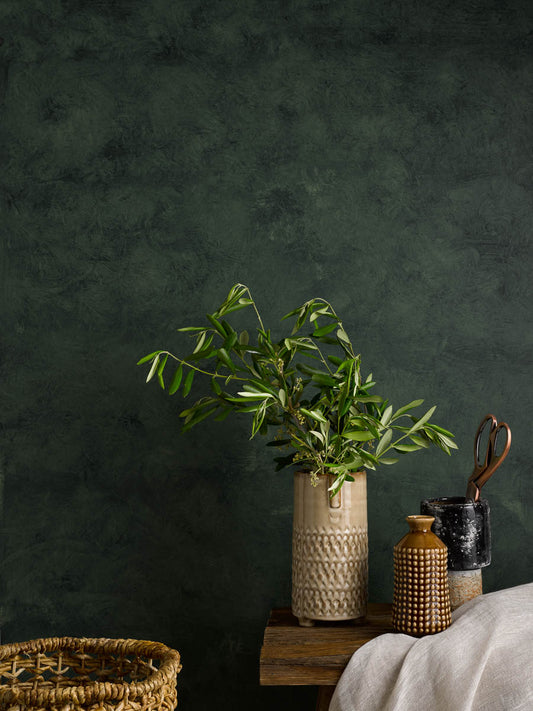
Artisan Range
Read more
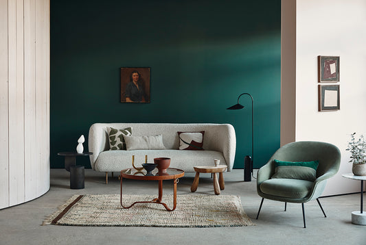
colour trend
FREE DELIVERY ON ALL ORDERS OVERS £50
HUGE RANGE OF BOLD & EXCITING COLOURS
OUR PREMIUM PAINTS ARE MADE TO LAST
ESTABLISHED & TRUSTED SINCE 1829
Your cart is empty
Please enter your age to prove you are over the age of 16.